Blog

Saplings in Snow


Remember road trips as a child (or parent of a child)? Remember asking “Are We There Yet?”, then thinking this is the loooongest trip and when will it end? Art is no different. The most common question asked by artists – whether new or experienced – is: how do I know when it is done? When is the painting finished?


There is an old saying: It takes two people to paint the painting: one to hold the brush, and the other to tell them when to put it down and step away. While I have never experienced the Art Fairy sweeping in before I could ruin the painting, I have found a tip that serves me well. Read on.


Start at the beginning

The best way to tell when you are done with the painting is to know from the planning stage where you are going to end up. Ask yourself what is the reason you are going to create this painting? I call this the WHY. As in, why are you taking the time, energy, and art supplies to make this painting? Or, why did you pick this subject?  The WHY can be “I love the light on that flower/tree/face”, or “the color red is so much fun to explore.” The WHY is a specific thing. For example, the texture of that one flower, not all the flowers and every single leaf.


The WHY is what prompts you to start the work. Sometimes it is called an “intention”, or the “story” you are trying to tell. The key to this is that each painting has ONLY ONE WHY. Rather like going to the airport: you get on one plane to one destination at a time. Today I am boarding a plane to Seattle. While I may be thinking about Boise, or Memphis, or Boston, those are not part of this plane ride. THIS trip is to Seattle. So it is with your painting: one gig today. Something else next week.


It is actually pretty easy to identify the Why for your project. Ask yourself what was it that made you stop in your tracks to set up the easel or take a photo? Why choose those flowers for the still life? What took your breath away? Use that as the WHY for the painting. This Why is the star of the show. The Diva. The lead guitar. The soloist. Everything else is there to make the star shine. Everything else becomes supporting cast: the backup singers, the costume department, the roadies loading the trucks, the distant trees, the flower pot. All helping us love the star player. Note that if the supporting elements start attracting too much attention, they compete with the star and need to be toned down. Focus on the Why. When you have accomplished your WHY, you stop painting.


In the painting, “Ankle Deep”, above, my why is the water lapping at the rocky shore. It was what made me stop and take the photo. Notice how much of the painting is water. The ripples and rocks in the water have more color and texture than anything else. I was really interested in the water. The trees, not so much. The background trees and rocks describe the edge of the lake but have little detail. They were not eliminated, merely played down so as not to compete with my Why. The distant hills are pushed to the back with atmospheric perspective and a few smudgy marks. The focal point is the sunlit rocks at the “rule of thirds”, but the focal point does not have to be the why. The why is my motivation, the focal point is the viewer’s payoff. Sometimes they are the same, sometimes not.


Stronger paintings have one thing to say.

This next example is two paintings of the same scene painted at different times. In “New Year Blues”, above, I loved the reflections and texture of the frozen water. This is my Why. Background trees are played down with general marks, little detail and subdued colors. A neutral wall. The painting does not work without them, but if they were presented in bright colors and carefully drawn, they would compete with the water. I wanted them to sit in the background to establish the setting. It was hard to resist the urge to make the trees colorful and more interesting. If I had done so, there would have been two strong statements competing for attention. The almost square format allows plenty of room in the foreground to extend reflections and describe the edge of the snow at the water line. Since this painting was about the water, I declared it finished. Those trees could be another work. As in the next painting.


“Platte River Blues”, below, is about the bare winter trees and the snowy riverbank. Notice this painting is not about the river. Your eye goes immediately to the color and texture at the back of the painting. Snow patches are larger and have more interesting color notes. Bushes are a little bigger and brighter. The river reflections are more subtle and bushes in the left foreground less vibrant so they act as supporting cast. The horizontal layout emphasizes the stretch and pattern of hillside and the rhythm of tree trunks from left to right.


A plein air example:


“Monarch Morning”, below, is all about the backlit bushes. The vertical composition directs the eye to my Why. This scene is at the edge of a pretty lake with paintable views everywhere. Early in the morning I loved the light coming from the left behind these trees. The foreground trees have minimal definition on the shadow side because the emphasis (my why) is on the glowing grasses and bushes. Background trees are loosely blocked in. Had I put more detail in these trees, they would have caught the viewer’s attention and drawn the eye away from the star of the show. They are less important and become supporting cast. The painting is finished without them. 


“Monarch Blues”, below, is painted from the same spot. The sunlight is no longer my why. Now I am interested in the color of distant haze under slightly overcast skies. It is my new why. All my planning has gone into describing that distance. The palette has cooled off, warm sunlight is downplayed, repeating shapes of distant mountains is emphasized. The trees and bushes on the left become supporting cast. They are necessary to move the viewer’s eye to the back of the painting. But the longer I stood there, the more I wanted to work on the foreground trees and bushes. (After all, I had just painted them in the last painting.) This painting is not about them, so the painting was finished and I walked away.


Finding another painting

Occasionally, I feel like there is more to say about the same subject.

“February Shadows”, below, was from a photo taken out the car window. I loved the shape and colors of the shadow: my Why. The shadow is the star of the show. A large stand of trees and bushes in the background are downplayed to keep the emphasis on that shadow shape receding into the distance. A foreground tree was eliminated and grasses and bushes were used to direct the eye back and forth from front to back echoing the shape of the shadow. When the snow shadow was described with colors and textures, it was time to stop.


I dislike painting the same piece again and again (original art should be original, not just a rerun). However, reversing the subject matter provides a new look at the same source material. New material has a new Why as well.


I was sorry to lose the trees in the background of the reference photo for “February Shadows”, so a few years later I painted “Saplings in the Snow”, below. The trees and bushes are now the star of the show with prime placement and saturated colors, and the snow shadow is supporting cast.  Notice the shadow is not full of vibrant colors or texture and its interesting pattern shape is softened. The painting was finished when the trees and bushes were completed even though the foreground shadow shape is still in a block in stage.


In both these paintings, the temptation to keep painting all the beautiful textures and colors of snow, bushes, trees, was great. The result would have been loads of lovely detail but a weaker message in the painting. Besides, once you start detailing and tweaking every inch of the painting, when do you stop?


Ah, we are back to the original question. How do I know when my painting is finished?

Your goal in creating the painting is to celebrate the primary thing you loved. The thing that made your heart skip a beat and nailed your feet to the ground. Tell the viewer about that one exciting thing. The other things you liked can star in different paintings on another day.

Remember, even cameras focus on one thing at a time regardless of how much is in the view finder.

Stop painting when you have described your Why …. And at least 30 minutes before you think you should have stopped.


Thanks for reading!


Going East on F Road

Wouldn’t it be nice if there was some signal that you had arrived at the final stage of a painting. Rather like the checkered flag at the racetrack. Some gong in your head that tells you to stop fussing with the painting and to step away.


In previous blogs I have discussed the 10 steps to a successful painting. Here is a quick review: step 1, determine your WHY, your intention. The reason why you are making the painting. Remember you only have one WHY. Anything else that you also loved will become another painting. This is crazy important to start the painting – and super important when you get to the final stages. More on this later. Step 2, the value study; 3, establish your palette (warm, cool, bright, somber); 4, think about a color study; 5, block in from the value study; 6, start breaking down shapes; steps 7 and 8, refine, adjust, clarify.  Step 9, AHA! This is when the gong and the flags come out. You have now arrived at the final lap in your journey with this painting. This is the “stand back, get a cup of tea, slow down and take a breath” stage. This is also where you refer to your original WHY. All your decisions up to this point have been to advance the WHY of your painting. Now that you are at the end, how did you do? Here is a check list

  • Does the basic value structure look like your original value study?
  • Is your WHY still the star of the show?
  • Do all the other elements of the painting contribute to the “star of the show” – or do they compete for attention?

If not, make corrections. If so, hooray! You are at the end. All that is left is to tweak a few details and sign the painting.


Let me walk you through the step 9 of a painting that was a recent workshop demo. Here is the reference photo, the WHY, and the value study. In the reference photo, the building is smack dab in the center, and the left third of the photo is grass, orchard, and mesa. A lot of empty space that does not contribute anything to my main subject. The value study shows that I eliminated the orchard/empty space on the left as well as some of the road in the foreground. 


Below is the painting as it appeared at the end of the demonstration.


When the painting arrived back at my studio, I had a “fresh” pair of eyes to evaluate it. Happily, it closely resembled the value structure I wanted for this work, and the silhouette of the building (the WHY) was well established. I chose a cool color palette and saw that the colors worked pretty well together. However, the painting had four major and four minor issues to think about.


First the little things –


The edges of the background trees looked like a continuous bright outline. The color and value needed to be toned down and broken up. Also, I added more dark value colors to the body of the trees to create variety, and cool notes to push them further into the distance, as shown below.


Next the mesa behind the trees in the middle background was just a large blob. The addition of a few marks of a different color (same value) gave it character and depth. I created a "slope" shape on the front of the mesa that acts as an arrow directing the eye to the center of interest (the building). The top of the mesa where it met the top of the tree was too harsh. I extended the tree upward and created a downward dip in the mesa to eliminate this conflict. This image shows that detail.


The shadow side of the buildings were not dark enough to describe the bright morning sun, so they were adjusted, as shown below. The sides of the buildings and the roof lines were uninteresting flat planes. A variety of colors helped create some character and break up the mass. Note that the roof line was balanced front to back.


The road in the foreground was too light so I darkened the value and adjusted the color to a richer, warm plumy-gray. The fruit trees on the lower left were finished.


Now the big things –


First, the chimney on the smaller wing of the building was off to the left side of the painting. I moved it further to the right, brightened the color note and added a highlight and shadow. This move helps anchor the building at a more optimal spot and stops the leftward shift out of the edge of the picture frame. This detail shows that change as well as color scumbled on the roof.


The vehicle trundling down the road is a nice touch to balance the mass of the building. However, in the initial painting it is too large. It suggested the building was the size of a doll house. I scraped off the vehicle and put in one more in scale with the size I wanted for the building. It became red to help cross pollinate the red of the chimney elsewhere in the painting.


Next, the road in the reference photo takes up 40% of the picture plane. To resolve this, the bottom of the painting was trimmed to eliminate excess roadway. Because of the place where the photo was taken, the road is too wide and the right hand edge is totally out of the picture. In the image above, you can see that I established a right hand edge to keep the viewer inside the picture plane. I trimmed the width of the road by pulling the left side toward the center and expanding the grassy area next to the building and trees. Then I noticed that the road stopped at the far edge of the building and the vehicle was driving into a wall of trees. I pushed some of the trees into the distance by using cooler colors and created a sun dappled road past the vehicle.


Finally, the mesa in the far background was silhouetted against the sky with a hard line. This competed with the silhouette of the building – which, as my WHY, is more important. I toned down the distant sky and lightened the edge of the mesa to eliminate the distracting edge. These images show before and after.


These corrections and changes took very little time but had a big impact on reducing elements that distracted the viewer or competed with my main objective: the silhouette of this building on a country road early in the morning. The finished painting appears at the top of this blog.  “Going East on F Road” 11x14 pastel. 


Thanks for reading!


July Sonata 12x9 Pastel

Did you have a stuffed animal when you were growing up? Was it the same color as the animal in real life? Probably not. (Think of all those blue, pink, yellow Easter toys.) Over the years my family’s menagerie included a turquoise poodle, red and green dinosaurs, a paisley alligator, and rabbits and bears in every color of the rainbow.


Regardless of the color of your bear, everyone recognizes it as a bear. This leads me to an artistic truism: It is not the color of the thing that tells us what it is. It is the shape, texture, and details that cause our brain to sort through its memory bank to identify the object correctly. Remember Andy Warhol and those blue, hot pink, red, and green Marilyn Monroes? You recognized who it was immediately.


It’s like that in art, too. Artists use color on the 2D surface to, among other things, describe depth, volume, distance, emotion. The trees in “July Sonata” 12x9, pastel, at the top of this blog, are violet, lavender, blue, pink, and turquoise in addition to multiple shades of green. This scene was captured on a screaming hot afternoon in July. I used the coolest colors in the trees to illustrate where there was an escape from the heat into the deep shade.  The almost orange pinkish colors indicate the transition from the shade into the glaring sunlight. Similarly, the grass is palest blue at the back to infer distance, then turquoise, green and finally pink and orange in the foreground to pull it forward in the picture plane. I know it is not a traditional rendering of the subject, but you still translated the shapes as trees.


In the painting “Frozen” 8x10, pastel, below, the snow in the foreground is actually yellow, and the snow in the background is pale blue. It all looks like white snow, but I used color to push some of it farther away from the viewer and pull some of it closer. When you look closely you can see the difference. At first glance it isn't noticeable. This painting was a demo for my pastel class. It has been accepted into the All Colorado show where it won Third place. The show continues at the Depot Art Gallery in Littleton, Colorado, until the end of August.


The piece below was painted during the Douglas County Land Conservancy invitational in June. Notice the subtle color difference between the field in the foreground and the field next to the red barn. Slightly warmer, slightly cooler. Do you see it? "Lowell Ranch in the Morning" 12x24", oil.


“Invitation to a Picnic” 8x10, oil, above, has trees in the distant back that are downright blue compared to the foliage on the tree closest to us. When you first look at the painting, it isn’t immediately obvious. The shadow on the ground is distinctly bluer on the back edge than on the front. This piece was painted plein air on a sizzling summer day at a private ranch in northern Colorado. The choice of colors suggests the hazy heat.


To sum up, this month’s blog asks whether it matters if the grass, trees, or Marilyn Monroe are painted a color not usually seen in nature? Put another way, is it alright if Winnie the Pooh is orange, Eeyore is blue, and Rabbit is yellow? Of course it is. Silly bear.


Thanks for reading!


[These are techniques that I will share in workshops in Santa Fe, NM, September 29-31, and October 2-3, 2022. Interested in painting the Fall colors of the Southwest? Go to [email protected].]


Ghost image

What happens to paintings that are not successful? Some can be reworked to correct whatever issues are keeping them from being their best selves. Some, like oil paintings, get covered with a layer of white paint or a fresh coat of ground or primer to take them back to their original “blank” state. And I have to admit that there are works that are so far from redemption that they quietly get chopped up to make birthday cards or end up in the rubbish bin. (My polite way of saying they should be burned in the street.)


The image at the top of this blog is a painting that annoyed me so much it was scrubbed off. You can see the ghost of the original piece. This surface is now ready for another painting. I do not mind ghost images because they create interesting colors and shapes that act as background for the next work.


Let’s talk about the next work. There is a place not far from where we used to live that has always stayed in my mind. The road climbed up a long hill and topped out in an open space at a beautiful meadow. Around the perimeter aspen trees stood tall. The meadow was the trailhead for a number of day trip hikes. In the Summer of 2019, my family planned a hike from this spot. Over the years some of the meadow and a big stand of aspen trees were cleared for a parking lot, but the rest was still as I remembered. I couldn’t wait to sketch and photograph while everyone else went hiking.


Fast forward to the scrubbed painting at the top of this blog. The dimensions of the paper were exactly what I was looking for to accommodate the stately aspens. I worked out the placement of the trees with small value studies and then began to draw the major shapes on the paper, below left.  


Next the dark areas were blocked in. In this image, above, right, you can see both the value studies on the left and the reference photo on the right. The ghost image is still visible – providing warm and cool washes in the background. This drawing established a “scaffolding” on which to build the painting to what I thought was the finished stage.


Pause here and think about some occasion when you had a project going and just knew it was not turning out as you expected. That moment when you say to yourself, “Self, this is on the verge of becoming a pile of poo.” There you stand, paint can at your feet and brush in hand looking at the bedroom wall, thinking it will be fine when it is all finished. You trudge on. Time goes by. You tolerate the bedroom wall. Eventually you decide it not only wasn't quite what was expected, it is dirty dog dreadful. Yeah, me too. So it is with this painting. I can see it has a serious composition problem and the sunlight isn’t reading correctly. Instead of zing it is boring.


I took it to a group of friends for their opinion. Among their comments were questions about the composition and about the light. Bingo. They reinforced my assessment. Back to the studio I went to have a heart to heart chat with the painting. I rearranged the trees, adding and removing some to create depth at the back and to fix the composition. Next I tackled the light and shadow. Foliage came and went to emphasize deeper shadows. Cast shadows on the ground and on tree trunks were moved, adjusted and extended. Highlights were emphasized. Voila!


The finished piece “Summer Aspens” 30 x 15”, pastel, below, now represents what I intended to say when I started out. By the way, if you look carefully (rather like looking for Waldo), you can still see some of the ghost of the original painting ... who turned out to be a friendly ghost after all.


Enjoy!


Adobe Autumn

 Years ago I learned that the color of sunshine changed with the seasons. At the time the concept seemed a little farfetched. The sun has not “changed” with respect to mortals on earth in a zillion millennia.


True, the earth spins, tilts and wobbles on its axis. We observe this most directly with the change of seasons as days lengthen or shorten depending on how the earth is oriented toward the sun. But those gyrations also can be seen in the strength and color of sunlight.

If I were to describe sunlight in each of the seasons, it might go something like this:

  • Winter light is cool, thin – even in the absence of snow
  • Spring light is delicate, warmer than winter
  • Summer light is hot, aggressive, heavy
  • Autumn light is buttery, rich, warm

To demonstrate the subtleties of this concept, compare these two plein air paintings. Both are adobe buildings in Taos. “Adobe Autumn”, 10x10” oil, at the top of this blog, and “Adobe Morning” 6x12” pastel, below, are within two miles of each other. The first was painted in September. The second in early May. Even on a sunny day, the sky, the trees, the adobe is warmer in the Fall and cooler in the Spring.


As an artist, I am sensitive to color. In plein air paintings this includes especially the color and quality of the available light.  Using my rule of thumb in the descriptions above, compare these two ponds, below. Both are 8x10” plein air paintings. The first, “Wednesday Green” is an oil completed in April.  The second, “The Golden Yacht Club” is a pastel painted in August. To emphasize the hot summer day at "The Golden Yacht Club", I painted it on a red surface and let the color of the background peek through to make the whole painting sizzle. Compare the background trees in each. In springtime the values and colors become more delicate as they recede. in summer the background has more aggressive colors and values.


Here is a studio winter scene, “Cascading Light”, 17x11” watercolor, next to “July Sonata”, 12x9” pastel, which was painted plein air in the dead heat of summer. The sky and shadows in “Cascading Light” do not have the saturated colors or the deep values as those in “July Sonata”. I might characterize them as thin. However, to describe the strong summer light in “July Sonata”, I deepened the tree shadows with red-violet (red is a complement to green) and let the background fade into a shimmer of noon time heat. Even the foreground grass seems ready to burst into flames.


The following two oil paintings fall into the trees-by-the-water category. “Spring’s Celebration” 8x10”  top, and “Exposed Roots” 11x14”, bottom. In the first, the emerging leaves are more delicate in color and saturation and grasses are a cooler yellow-green in the spring. Compare those with more warm greens in the second painting. Notice also that the tree trunks are not as warm in the springtime light - shifting almost blue.


To wrap up, here are two plein air winter paintings, both 8x10” oil. “Bear Creek Shadows” on a sunny day, and “Blue Notes, New Year’s Day” on a slightly overcast January 1st.  I pushed the yellow/orange notes on the background willows in the first painting to explain the sunshine and make the scene more lively. Notice that both pieces start to fade to a grey blue in the back half of the painting because of the thin sunlight.


There you have it. To answer the question, "What’s up with the sunshine?", I say there's a lot up (pun intended) with sunlight throughout the year. Enjoy!


Diane


Hallett Peak, Rocky Mountain National Park

I am often asked about plein air painting:   why or why not, do’s or don’ts.


The benefits of plein air painting are many.

  • it pushes you to quickly evaluate potential subjects and settle on an effective composition that will convey your message or story,
  • it requires that you think on your feet and be decisive,
  • you learn that shadows are full of color and texture rather than just the dark holes seen in photographs,
  • painting from life trains your eyes to see nuances of color that photos cannot show,
  • and *bonus* you have an excuse to hang around in the fresh air, sometimes with painting buddies, listen to the birds, enjoy green growies and watch drifting clouds.


Drawbacks are

  • that you must haul your gear to a painting site (upside: learning to pack light),
  • that you must deal with changing weather; I have painted in rain, snow, hail, sun and shade, and wind strong enough to (literally) blow the easel across a lot and down a hill,
  • that the earth is constantly moving, causing shadows to lengthen or shorten and the light to intensify or fade, depending on the time of day, all of which alter the temperature and quality of colors as the time goes on,
  • that while enjoying all that fresh air, you become lunch or dinner for some voracious mosquitoes or horseflies; I have tried every brand of bug repellant only to discover the bugs consider all of them a gourmet sauce for the main course (me).

Plein air painting is not for everyone. However, I am a fan. I enjoy the process, the challenges, the opportunity to fine tune skills that strengthen paintings later created in the studio. It also keeps me humble trying to master my craft and create something in spite of the conditions. While some artists spend multiple days in the field producing large paintings, I maintain my sanity by remembering that in a morning or afternoon there is not time to paint a big, finished piece. Being satisfied with smaller pieces and sketches keeps my head from exploding.


All of this comes to mind as I am nursing a sunburn (another drawback to plein air painting) acquired while painting in Rocky Mountain National Park and Estes Park, Colorado, during the past two weeks. My sunburn resulted from the wind creating “Mary Poppins” moments with my umbrella and hat, leaving me hanging on to the easel in the sunshine. The event was the Estes Valley Plein Air 2021, sponsored by the Art Center of Estes Park. www.artcenterofestes.com.  The gallery is hosting a show of the participating artist's work from now to September 25. 


The first week out painting was smoky and hazy because of smoke from the 83 large wildfires in the Western US. The second week the wind came up and cleared the air (a very good thing) and blew fiercely (not so good, mentioned above). The photo below shows the view from Estes Park on Aug 16. The photo at the top of this blog shows the view on Aug 23. This illustrates another aspect of plein air painting: you need to deal with what is in front of you. I remember heading out to paint a slightly dilapidated old farmhouse, only to discover when I got there that the historical society who owned the building decided to apply a fresh coat of paint. Props to them for being good stewards. Bummer for me that my painting idea was gone.


My plein air set up, shown in the photo below. In addition to pigments and paper, includes easel, umbrella, turp, hat, paper towels or rags, trash bag, and thumbnails (always do a thumbnail/value study). The pole for the umbrella is in the bottom left corner, the umbrella is the just visible gray triangle in the top left corner. My hat is hanging off the upper right corner of the easel. Important items that are not apparent in this photo are sunscreen, insect repellant, water. Some artists consider a thermos of coffee another essential item.


The next photo shows the resulting painting, “River Stones” 10x8” oil. Another version of this scene was auctioned as part of a plein air quick paint during the Plein Air event. Photos of the paintings included in the show didn’t turn out, but I will take better ones when the pieces come home after September 26.


If you are thinking of taking up plein air painting, I encourage you to give it a go. If nothing else, it will get you out of the house away from your boring chores. If you encounter a plein air painter when you are out and about, be gentle and generous. They might just be trying to avoid doing the laundry.


Thanks for reading!

Diane


Dancing Shadows

Let’s talk about underpaintings. Some artists do, and some artists don’t. Underpaint, I mean.


I am frequently asked how I start a painting. The answer often mentions an underpainting and depends on the medium I am using and how an underpainting will contribute (or not) to the finished product.


First a definition of sorts:

an underpainting is whatever goes on the prepared substrate before the “actual” painting takes place


This excludes products and steps taken to prepare the surface/substrate for the proposed artwork. For non-artists among you, these could be primers, sealers, paste, grit, and more, whose purpose is to seal, shape or texture the surface before the art begins. For our discussion, underpainting is pigment, stain or ink on the prepared surface.


Okay. Back to the question of using underpainting. I paint in watercolor, oil, and pastel. Traditional (not to be confused with experimental) watercolor artists rarely use an underpainting. One of the objectives of traditional watercolor is to preserve the white/light qualities of the original surface. To cover it up with paint defeats this purpose.


Moving on to oil, oil painters sometimes refer to the initial underpainting as a “block in”.  I usually begin oil paintings with a block in and consider it a form of underpainting.


This brings us to pastel. I often use an underpainting with pastels. There are several methods of doing this – and I teach workshops on these various methods – but for today let us focus only on a watercolor underpainting.


There are a number of valid reasons to take the extra step of creating an underpainting.

  • It allows me to establish values that create the compositional structure of the painting
  • Watercolor does not fill the “tooth” of the paper that is useful in pastel application
  • An underpainting covers the color of the original paper – especially light colored paper – so fewer layers of pastel are needed to completely cover the paper’s surface in areas where I do not want the surface to be visible (example: dark shadows on light paper)
  • As a watercolorist, I enjoy the effect of charging washes and watching pigments blend to achieve interesting effects for the finished painting

Here are four examples of initial underpaintings, as well as the final products:


First, “Dancing Shadows” 5x12”, at the top of this blog, began as a demo for my pastel class. The focus of the class was light sources. You can clearly see the various sources in the shadows on the snow. The underpainting, below, uses two colors of blue and one green. The light areas are bare UArt paper. The purpose of the underpainting was to establish where the dark, middle and light areas of the painting were going to be. I didn’t need a lot of colors to do this – just the correct values. In the finished painting you can see how the nuances used to describe light and shadow in the scene were built on top of the values in the underpainting.


 Dancing Shadows underpainting


Secondly, “Chiseled” 16x12”, depicts a rock face near Ghost Ranch in northern New Mexico. I loved how the various geologic layers glowed in the afternoon sun. After establishing a drawing, I began underpainting up planes and down planes (Fig. 1, below) to lay out a colorful road map of light and shadow. Then I began applying pastel, starting at the top of the painting and working down. Fig 2, below, is a detail showing how pastel is being applied on the underpainting. Notice how the underpainting already defined gradations and shifts in value for the sky and rocks.


Chiseled Fig. 1 


Chiseled Fig. 2


The finished painting appears below. Incidentally, I liked the watercolor underpainting well enough to paint another version that became “Desert Sculpture” 19x15”. You can find it in my watercolor inventory, or with the link,  data.fineartstudioonline.com/cfgeditworks_v2.asp?action=edit&KEY=3479781


Chiseled


“Breaking Away” 12x16”, below, is our next example.


A little background: Lawn Lake Dam was located in Rocky Mountain National Park upstream of Estes Park, Colorado. It was an embankment dam constructed in 1903 which failed in 1982, gouging out the mountainside, flooding a valley below as well as the town miles away. An alluvial fan was created at the bottom of the mountain and resulted in some lovely waterfalls where the mountain washed away. One summer I was crawling across exposed boulders near the waterfall, taking photos as the morning sun cleared the trees. On my right I noticed a little blurp of water had broken away from the main channel and was cheerfully tumbling along as the first finger of sun hit it. I could not resist snapping reference photos that became this painting.


Breaking Away


The underpainting, below, was handled much like “Chiseled” (mentioned above). Light areas in the finished painting were left blank and the rocks were painted blue, violet, orange to create a colorful base for them in sunlight and shadow.


Breaking Away underpainting


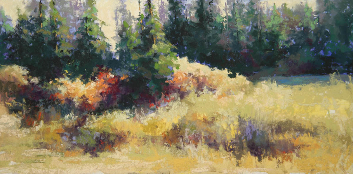
Finally, the last example is “Saplings in Snow” 7x9”, below. This painting is all about values and the complementary colors blue and orange. Late afternoon light created this deep shadow on a hillside while highlighting the bare trees and dormant vegetation on the opposite hill. Everything about it appealed to me. To emphasize the contrast, I laid in an underpainting with strong, saturated colors, shown below.  The finished painting, below, has a sense of deep shadow filled with sky color, and bright, glowing sunlit saplings and bushes.


Saplings underpainting


Saplings in Snow


To wrap up, let me add a clarification for novices: it is not mandatory that every crumb of the underpainting be covered with pastel. Having bits of the underpainting peek through the final pastel layers is part of the creative process and often adds a touch of unexpected color notes and sense of fresh mark making.  In other words, it helps keep me from overworking the painting. In "Saplings in Snow", above, there are little areas of the underpainting that are still visible. Having said that, note that almost all competitive exhibitions require that at least 80% of the finished painting is pastel. Pastel works with large areas of eexposed underpainting are defined as "mixed media" and head off to competitions that offer that category.


I have used underpaintings for several years and feel it works well for me. As you begin your next painting, consider this painting step as a method for starting. Let me know how it does (or does not) work.


Thanks!


Diane


Golden Guardian

This month’s topic is the Rule of Thirds. [Fanfare]


The Rule of Thirds is a concept that has to do with the placement of objects in the painting. When a painting is divided into thirds horizontally and vertically, the theory is that the strongest/optimum position of objects is at one of the “sweet spots” created where grid lines intersect. This is often mentioned in the same sentence as Fibonacci’s sequence and the Golden Mean. Those of you with a mathematical kind of mind will understand the reference. In fact, the concepts are similar but not the same. Using the Rule of Thirds only puts objects approximately at the Golden Mean. The diagram below, right, shows a square divided into thirds horizontally and vertically, and the intersection points on the grid where these lines meet.


This rule is true regardless of the shape of the painting or the subject matter, as seen in the figures, above on the right, and in the following examples of  paintings.


I am a Rule of Thirds enthusiast and encourage my students to use it as well. A little factoid: this rule is really a photographic concept to teach newbie photographers to stop putting the subject in the center of the frame. Put in the simplest terms, the Rule of Thirds is intended to create interest in the painting/photo by creating asymmetrical compositions. It helps prevent the artist from putting the subject smack in the center (the bull’s eye approach) or squished into corners.


Here it is in practice:


“Blue Pot with Orange Slice”8x10 oil, Sold, below. What I love about this little still life are the reflections in the blue pot of the orange, leaf and red grape. To assist you in finding that spot, I put a little starburst where the lines intersect in the middle of this reflection. When I laid out the painting on the canvas, I made sure the reflection was in the strongest place on the painting, and then simplified the background and surrounding areas to keep the viewer coming back to this spot. The original painting (without the starburst) is in the Archive inventory on my website.


In “Golden Guardians” 18x24 watercolor, Sold, at the top of this blog, the most exciting thing to me was the light bouncing around in the shadow cast by the rock outcropping. Many of the directional lines in the composition point to this area to move the viewer to this spot. The color notes and detail found in this shadow create interest to keep the viewer anchored here.


When I started working on the concept for “Vespers” 20x12 pastel, below, left, my interest was drawn to these two vertical rock faces. I arranged the composition so they lined up with the vertical Rule of Third lines. As I blocked in the composition, the area that excited me most was the cool, atmospheric blues on the right side as this monolithic mesa moved toward the back of the picture plane. To emphasize the area, I lightened the sky to create a crisp edge and made the mesa in the far distance more blue. Side note: in my Watercolor inventory there is a painting “Scent of Distant Rain”. Look closely and you can see the area of the scene that was the inspiration for Vespers.


“Adobe Morning” 6x12 pastel, above, right, is the final example. While on a painting excursion in Taos many years ago, I drove past this little adobe house early one morning. I really liked the way the adobe glowed in the morning sun. The grass, still damp with dew, echoed the color of the clear blue sky. In fact, the red/orange and blue/green scene appealed to me as a ready made complementary color palette. The next morning I set up my easel. This scene could have been composed any one of a number of ways, but I wanted to emphasize the long, low building. A wide horizontal layout was the answer. The entire scene is anchored by the windows and the coyote fence that I placed at the intersection of the bottom left rule of third lines. Notice that at this spot on the painting the fence has interesting irregularities and the windows are outlined in Taos blue. Finally, because this building creates a lot of “weight” in this corner of the painting, I balanced it with an extension of the fence and a large sky hole on the right side.


There you have it. Now that I have extolled the wonders of the Rule of Thirds, let me add a disclaimer.


There are exceptions to the rule. Of course there are. Sometimes artists choose to place the subject in the center in defiance of this rule. Portraits are a good example. However, the good old fashioned “CEO” pose sitting stiffly in the middle of the canvas was originally used to suggest solidity, temperance, no nonsense attributes that were the hallmarks of business leaders. Very formal. Loads of portraits are intended to be character studies that express something about the subject. An attribute that bull’s eye formal paintings don’t do but Rule of Thirds paintings can. 


Thanks for reading!


Cascading Light, watercolor

This month I was asked twice to give presentations on the subject of snow. The first was a webinar for the Pastel Society of Colorado; the second was a guest blog for the website "How To Pastel". Since both of these groups are pastel painters, the paintings included, other than Cascading Light, above, are all pastels. The following is Part Two of the information included in these presentations. The first half appeared last week. 


Warm Up to Snow


Too often winter scenes are glaring white and drab gray. Whether working in your studio from photographs, or – egad! - painting en plein air, here are a few tips on making your winter scenes sparkle.  They include: 1) lighting, 2) atmospheric perspective, 3) warm (yes, warm) and cool color palettes, 4) complementary and analogous color schemes, and 5) nuanced colors. Let's resume the discussion with tip number three:


3)      Paintings can often be classified as mostly warm or mostly cool. This is true of paintings with snow.  “Late Light, Lewis Road” (on the left, below) is a warm painting.  The sky is a slightly greenish blue (rather than Robin’s egg blue) and the plums and grays in the far background are warm.  “Cold Sunshine” (on the right), however, is a cool painting. Even the sky is cold.


4)      As you decide on your palette, take advantage of complementary color schemes: color families that are on opposite sides of the color wheel; or analogous color schemes: color families next to each other on the color wheel.  Winter scenes lend themselves to complementary blue/orange palettes.  Look for drama in an analogous palette like that in “Saplings in the Snow” (below). The palette in this painting ranges from yellow to orange, and red violet to violet, all of which are neighbors on the same side of the color wheel.


5)      While it is tempting to use your brightest blue and most dazzling white to capture snow colors, too much is, well, too much of a good thing.  Balance these saturated color notes with well chosen, nuanced neutrals.  Winter is full of interesting grays in bare branches, dormant bushes, tree trunks.  But gray does not mean a shade of black.  Instead, look for rich, neutralized versions of the colors you are already using in your painting.  This creates overall harmony and a wonderful depth to the painting and allows bright notes of color to really pop in comparison.    In the paintings “The Way Home” and “February Shadows”, the use of neutralized, or “grayed” plum, orange and blue color notes let the sizzling brights sing without derailing the painting. 


The underpainting for “The Way Home” (below, left) establishes the warm palette.  Tree shadows across the path use atmospheric perspective to change from a greenish-blue in the foreground to cobalt blue and, finally, a soft violet-blue in the far background.


        underpainting


 “February Shadows” concentrates the most vivid color notes in the foreground. As the scene recedes into the distance, the bright green-blue of the foreground shadow becomes a softer, cooler blue. Even the red-orange of the bushes becomes a soft salmon and lavender at the rear of the picture plane.


Let’s pull all of this together in two final paintings, “Willows in Winter” and “Middle Fork Afternoon”.  In my part of the country, willows along rivers and in wetlands show off orange red branches in the winter.  A sunny winter day creates a wonderful complementary color palette of blue and orange. In “Willows in Winter” the color emphasis is on the crystal blue sky and the red-orange-yellow willows and underbrush. “Middle Fork Afternoon” is all about the shadow in the ditch in the foreground. In both paintings, the rich, vibrant blues and saturated yellow-orange bushes are balanced with a full range of grays in blue, violet, brown and tan.  These rich neutrals allow the stronger, complementary blues and oranges to take center stage without taking over.   As these bright colors appear closer to the edges of the painting and toward the back of the picture plane, they, too, become less vibrant and more neutralized. The foreground snow is a creamy white changing to pink and lavender along the far horizon.


       Willows in Winter


     Middle Fork Afternoon


There you have it. The next time snow is in the forecast, make a cup of tea, get out your richest pastels and warm up to the wonderful possibilities of snow.


Thanks for reading! Enjoy!


Diane


This month I was asked twice to give presentations on the subject of snow. The first was a webinar for the Pastel Society of Colorado; the second will appear this week in a guest blog for the website "How To Pastel". Since both of these groups are pastel painters, the paintings included are all pastels. The following is Part One of the information included in these presentations. The second half will appear next week.  


Warm Up To Snow


Too often winter scenes are glaring white and drab gray. Whether working in your studio from photographs, or – egad! - painting en plein air, here are a few tips on making your winter scenes sparkle.  They include: 1) lighting, 2) atmospheric perspective, 3) warm (yes, warm) and cool color palettes, 4) complementary and analogous color schemes, and 5) nuanced colors.


1)      The type of light on your snow is important in deciding how to handle the scene.  On a sunny day the color of the light is pretty easy to sort out:  winter skies are often a clear, brilliant blue, therefore, snow in sunlight is warm; snow in shadow is cool because it is lit from the sky above. The colors range from warm cream for snow in the foreground to cooler blue snow in the background. These all “read” as white, although none of them actually are. Shadows on a sunny day get their color from the sky. Again, the colors are warmer in shadows in the foreground  and shift to cool for shadows in the back of the painting. In the painting “Winter Skirt” (data.fineartstudioonline.com/cfgeditworks_v2.asp?action=edit&KEY=3479762) the snow moves in and out of the shadow in the foreground and recedes into the background. In “Dancing shadows”, above, shadows move across the sundrenched surface of the snow as well as recede to the edge of the trees in the background.


On overcast days, or times when the sun is not fully above the horizon, look for the softer blue-gray of the sky and rich neutrals for shadows. Remember that the overcast shadows have darker values that are the result of the dimmer ambient light.  Lastly, remember that sunrise and sunset create a warm glow like that in “Winter Heat”. This painting is a good example of the neutralized blue of the snow in the shadow of the trees. lightnshadowstudio.com/workszoom/3530541/winter-heat#/


2)      We all know the rules of atmospheric perspective:  closer objects are warmer, have more texture and harder edges; distant objects are cooler with minimal texture, soft edges and less value contrast.  So it is with snow.  In the paintings, “New Year Blues” and “Frozen”, the sunlit snow in the foreground is a pale buttery cream; the snow in the background is pale blue and delicate pink.  Nothing is flat white.  The effect is that some of the snow comes forward and some of the snow recedes into the distance.

Atmospheric Perspective is also an important factor in shadows.  In “Bear Creek Light” snow shadows are blue-green in the foreground, changing to blue with some violet, and becoming a more neutralized blue toward the back. The sunny snow follows the same rules where the snow in the foreground is light yellow and snow in the far background is actually pinkish/lavender.


New Year Blues                                                                                Frozen


Bear Creek Light


Next week Part Two will continue my discussion of things to use to strengthen your snow paintings, and wrap it all up with additional painting images. Thanks for reading!


Diane